The Brief
Sema software, a startup based in the US, offers comprehensive reports that evaluate the quality of code, code security, and third party IP risk. It needed a new brand identity to match its rapid growth and reflect upon the values and influences that informed the founders and employees. The brief was to create a brand identity, light design system and execution designs for a new website that matched the company's status and ambition whilst reflecting these values and influences.
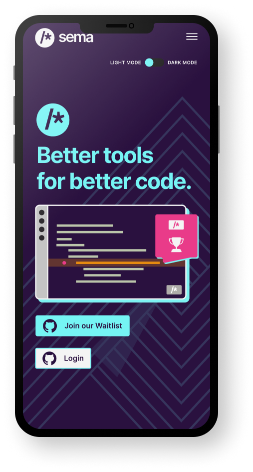
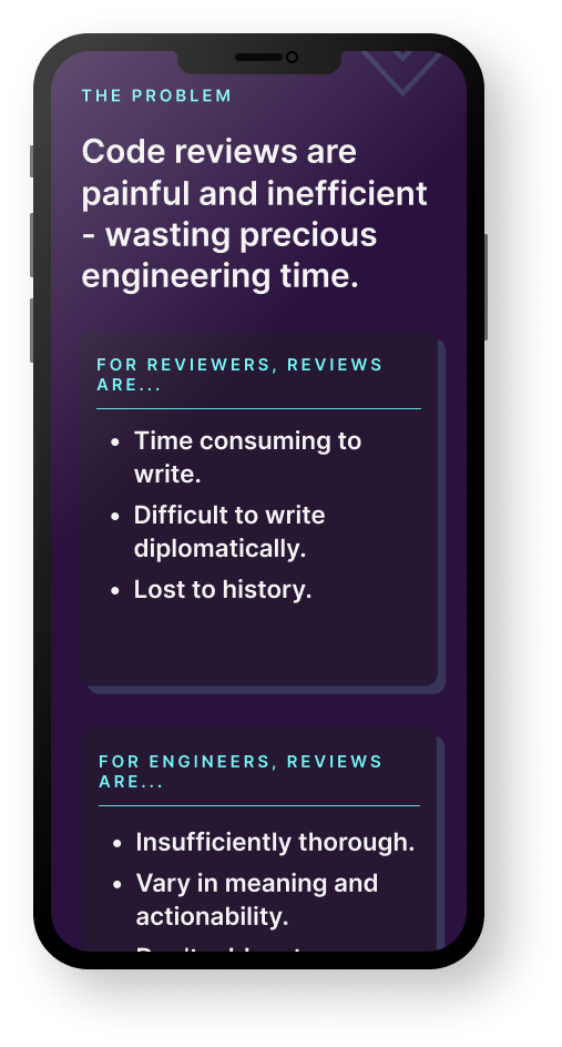
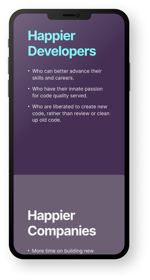
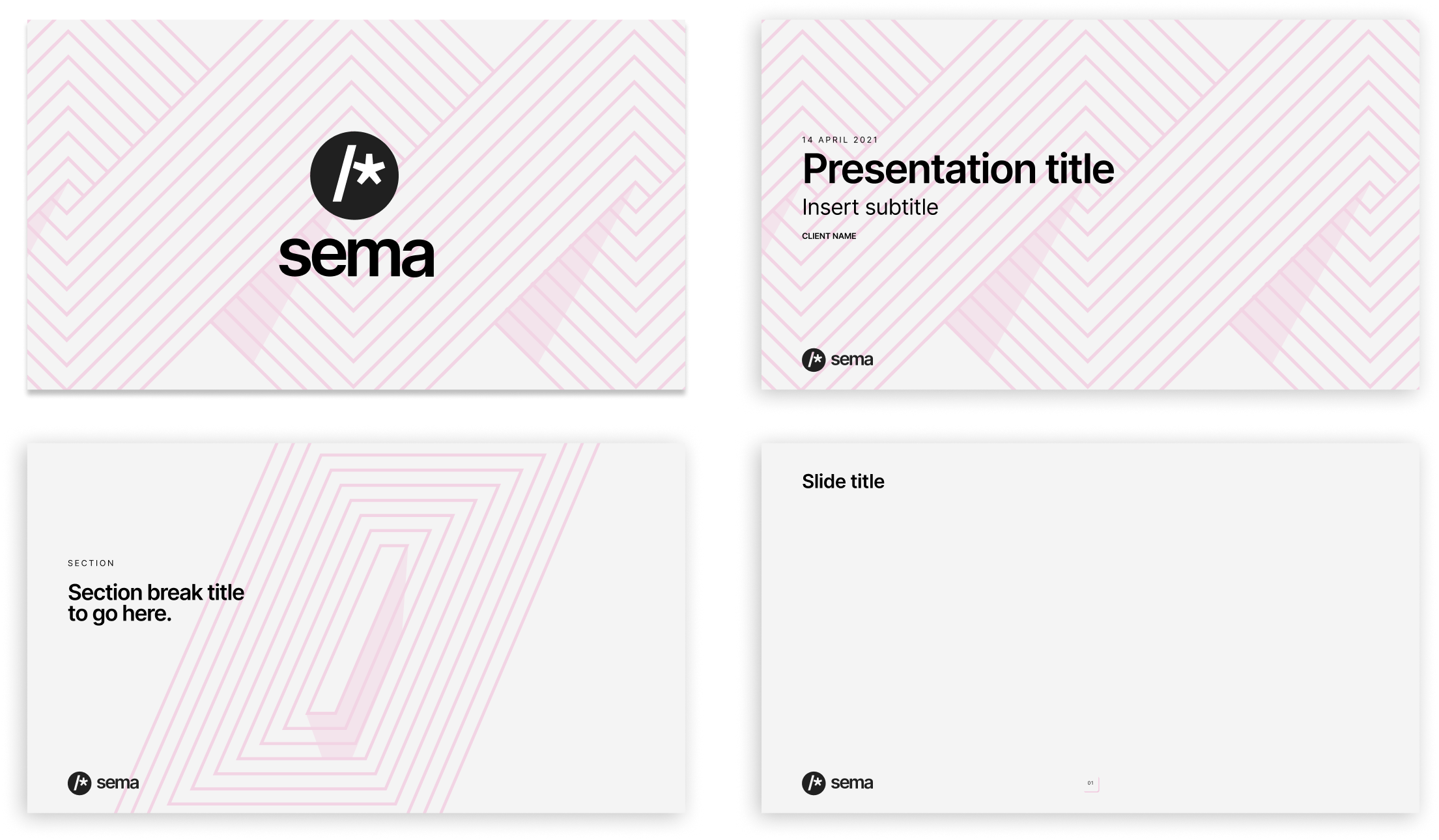
Working closely with the CEO with regular catch-ups, the project started with sharpening the brand values and principles before launching into image mood boards and exploring a number of territories. Once agreeing on a territory, the core brand assets were developed, including Core logo marks, colourways, shorthand and typography. Phase II included designs for a number of applications including design for an MVP website, eventually working with a developer to support the build.
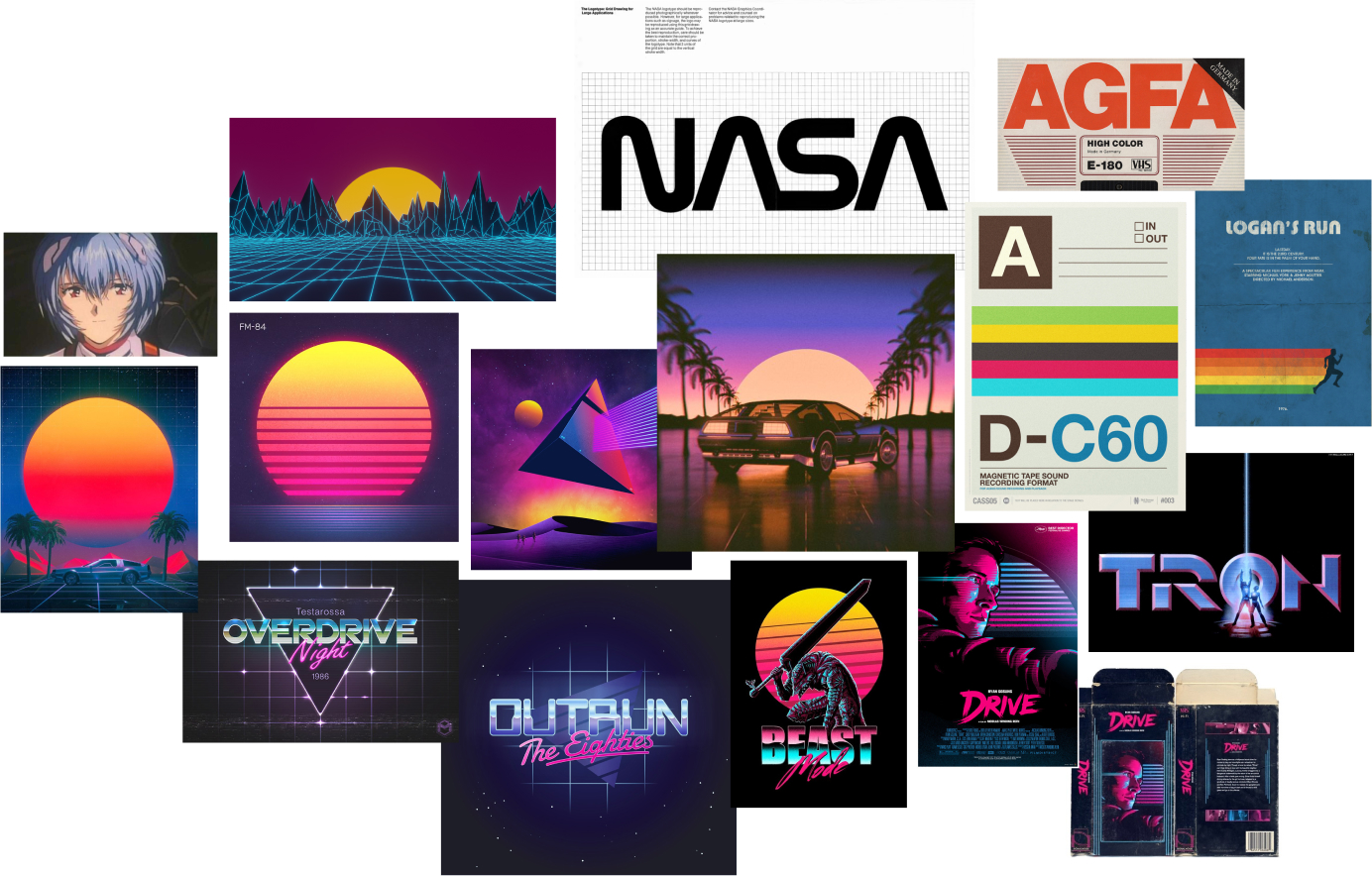
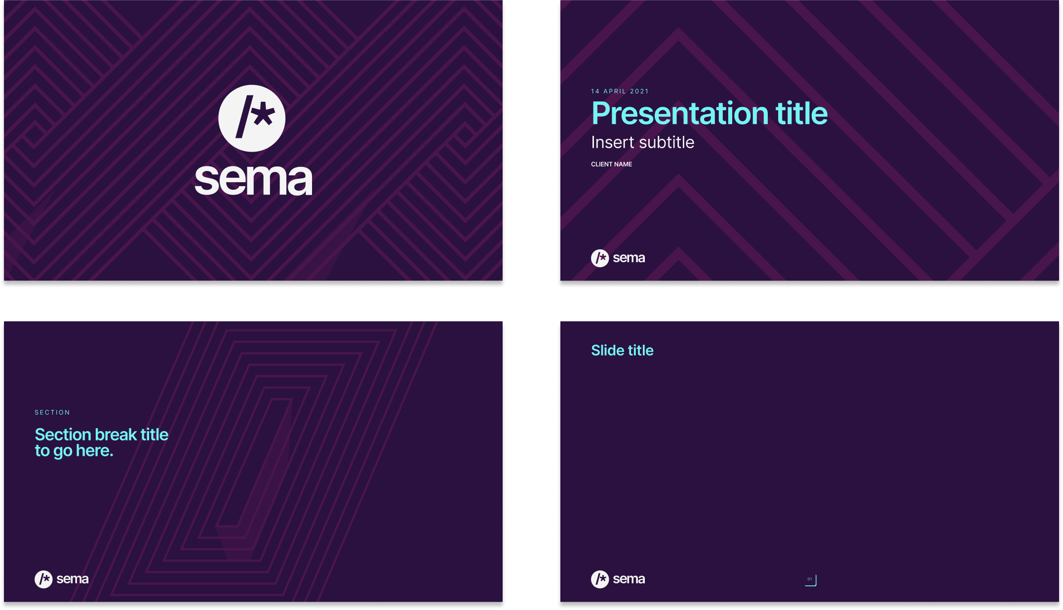
The 80's era was a period that symbolised the growth of nerd culture and the explosion of computing, it resonated with the stakeholders and heavily influenced the development of the brand identity.

Logo Horizontal

Logo Vertical
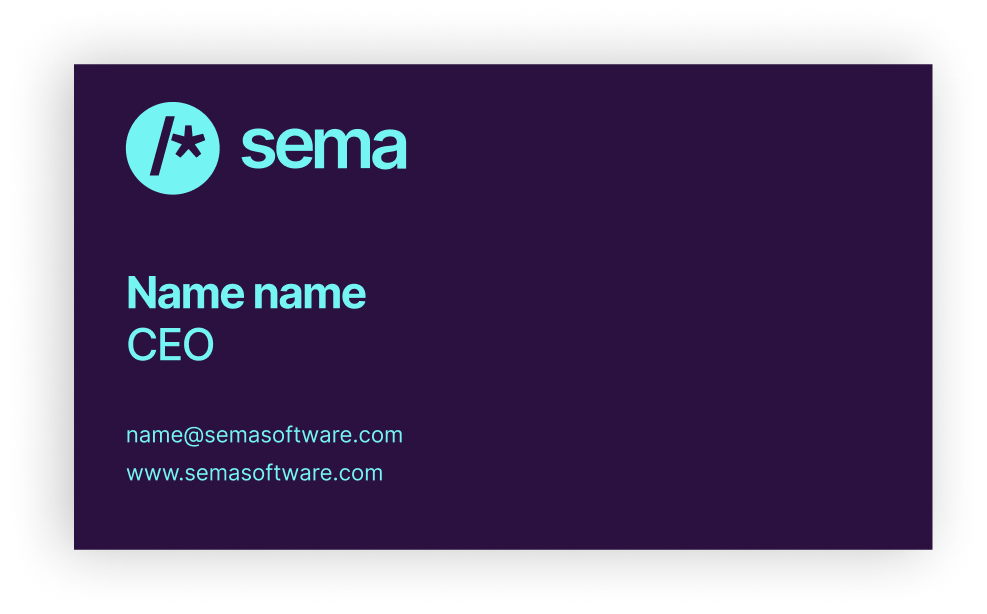
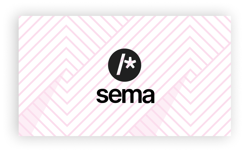
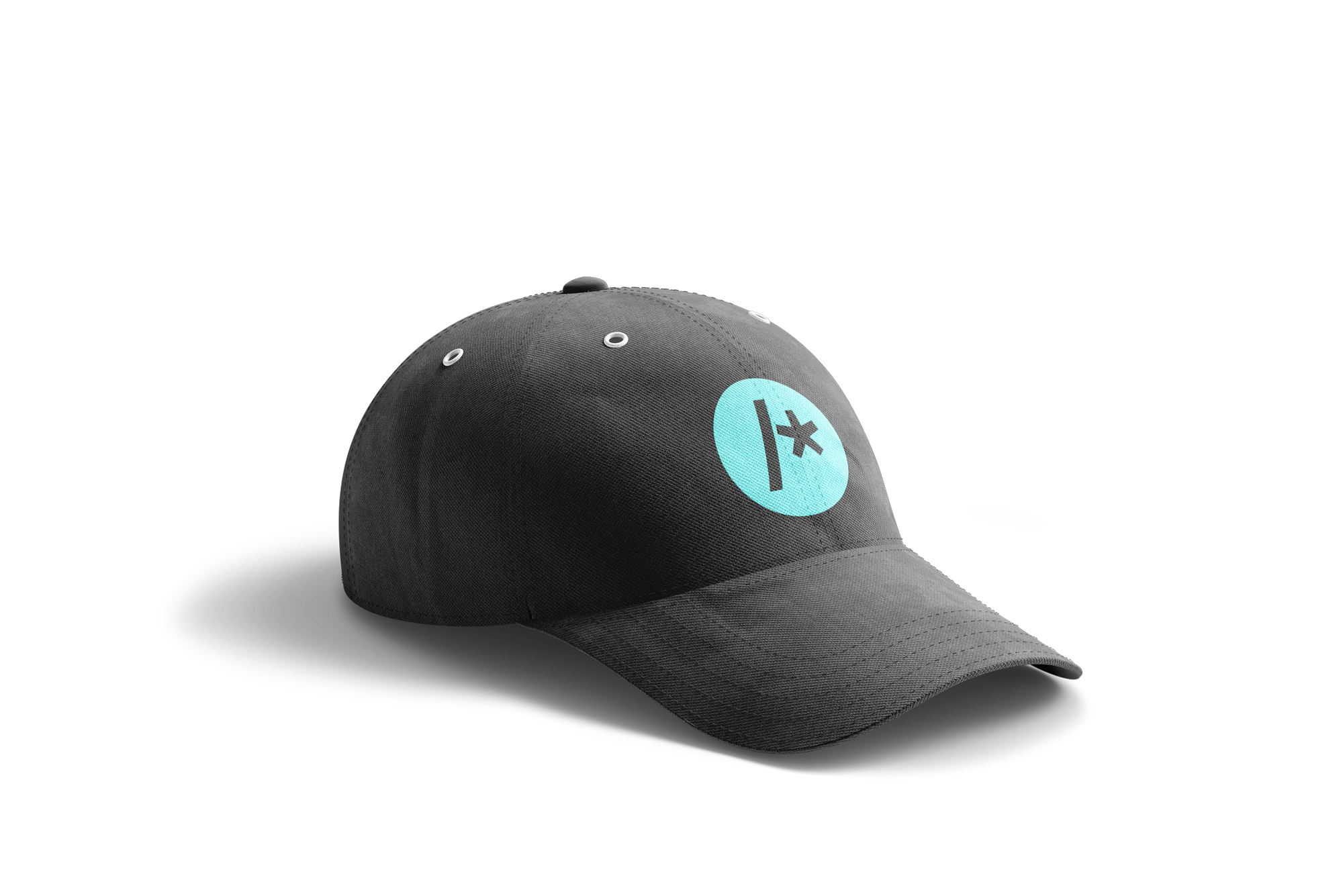
The Sema software codebase intelligently comments on the quality of written code (using some very clever algorithms). The logomark was developed to reflect this with the '/*' ASCII characters, which are used to add instructional comments inline, being used as the core of the mark. A circular type keeps the mark in the modern era (allowing the vibrant neon colours to reference the 80s).

Shorthand - Full Circle

Shorthand - Slash


Inter - Bold
-4% Character Spacing


Selected Projects
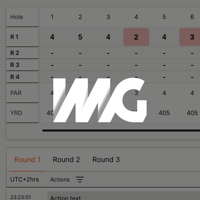
B2B Sports Data Platform - UX /UI DesignProject type
Grosvenor - UX/UI DesignProject type

Duke Of Edinburgh Award - Social CampaignProject type

Property MarketingProject type

KitKat - The Break Emoji Social CampaignProject type

Special Olympics - Encourage Omar CampaignProject type
HiltiProject type
CalpolProject type
Brand Films - Concept / Art DirectionProject type

