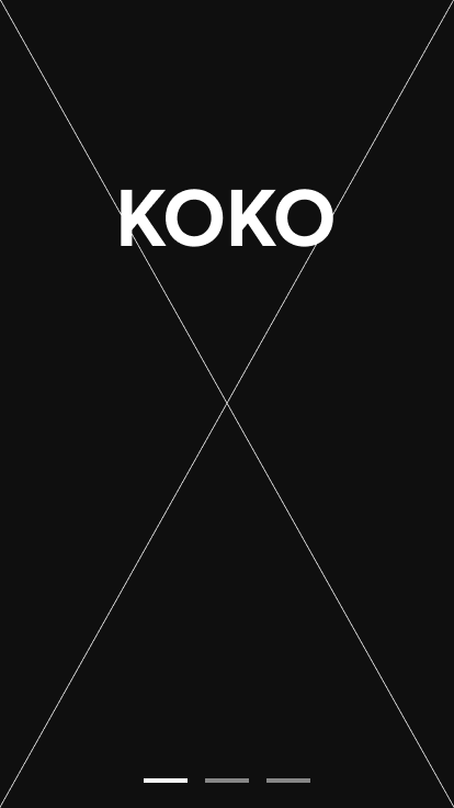
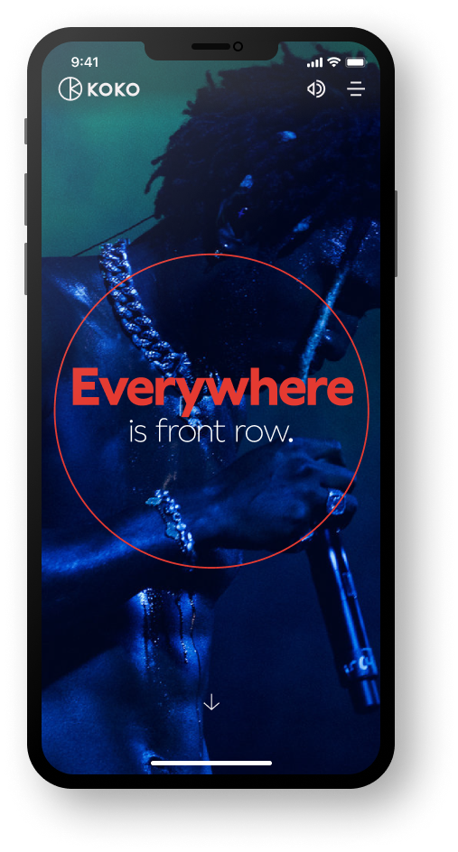
KOKO Relaunch
A great project, working with the brilliant team at DixonBaxi on the digital experience for the relaunch of KOKO. Helping define UX and design a responsive UI site for the MVP phase of the project.
The task to solve.
This was defined as an MVP phase of the project and the build at this point was to be limited. Yet the design solution needed to set the path for future developments and provide a framework for 'possible' new features and live event experiences. In early stakeholder meetings, it was also clear that what was to be produced needed to be super super flexible, the level of detail, assets and demands by the many many different artists performing at KOKO would vary immensely. Additionally a key requirement was the ability to add promotions at any point for a wide variety of reasons, such as, promotor requests, low ticket sales and last-minute changes.
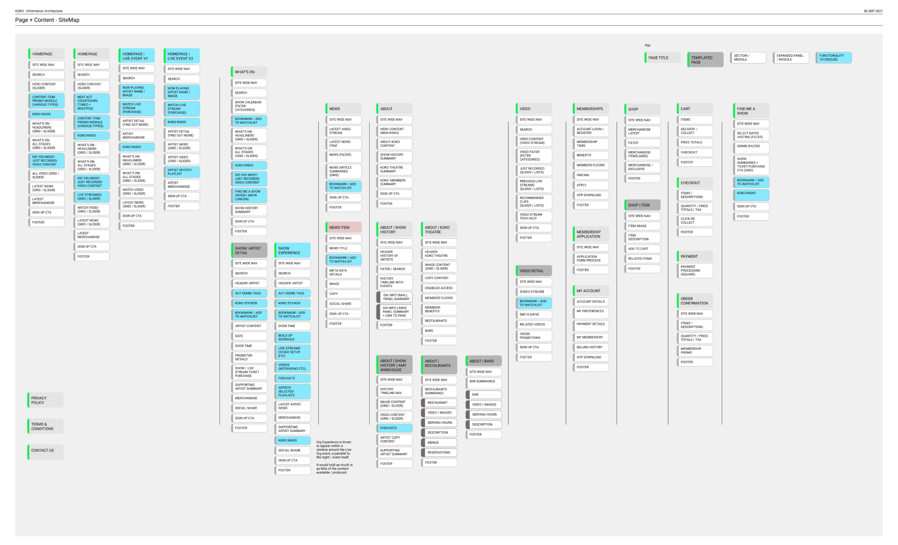
Providing clarity.
In the first phase, we needed to align on a structure/ roadmap.
I find informational architecture diagrams really help in providing clarity to clients who may be less familiar with online builds. This also allows all stakeholders to quickly agree on the key areas of priority, the content required and a map to refer to throughout the process.
Multiple workshop sessions were held to develop a structure that set out the ambition for the relaunch of KOKO, to deliver various viewing options and to build on its destination for real-life experiences with numerous tiers of membership.
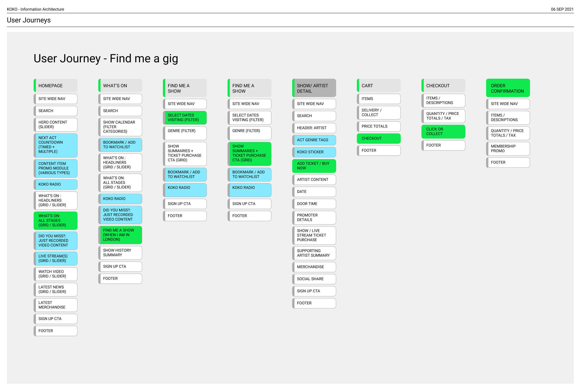
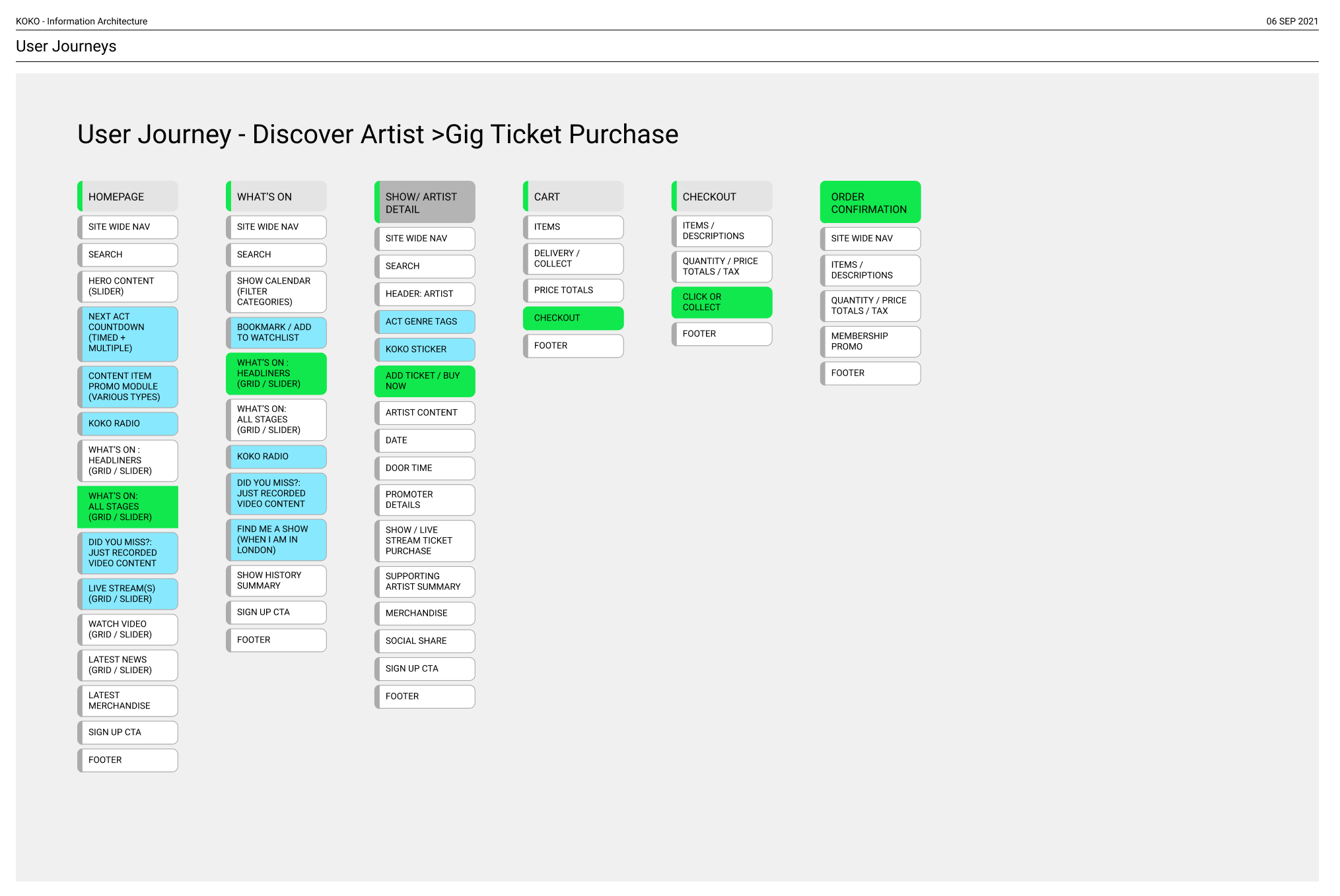
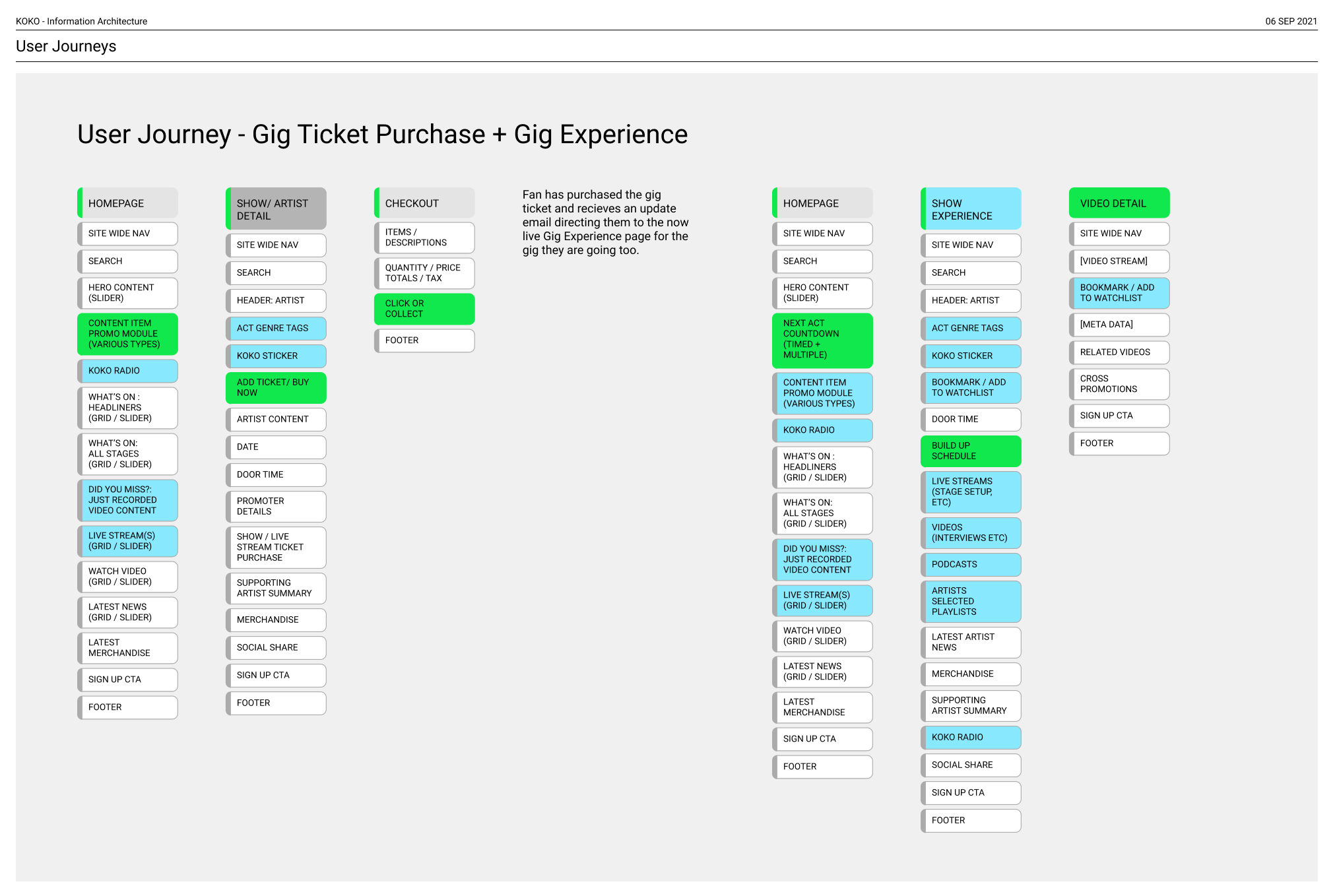
Exploring user flows.
Again to help visualise the users' journey and the opportunities for cross-promotion and discovery, user flows for key paths were drawn up and discussed. This helped align views on being able to provide clear paths as quickly as possible to users and deliver on stakeholder requirements for discovery, cross-promotion and highlighting the breadth of acts.
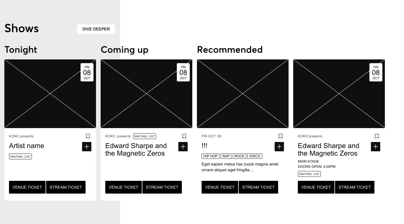
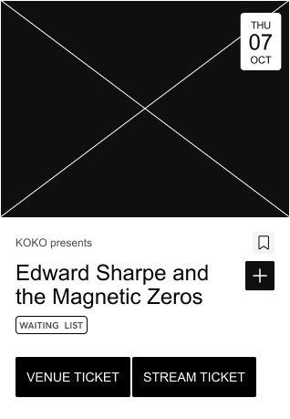
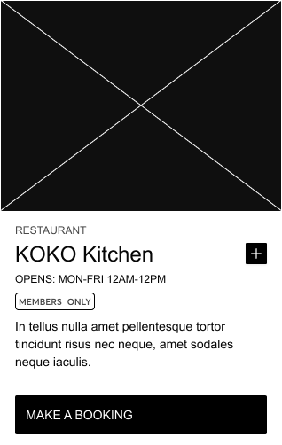
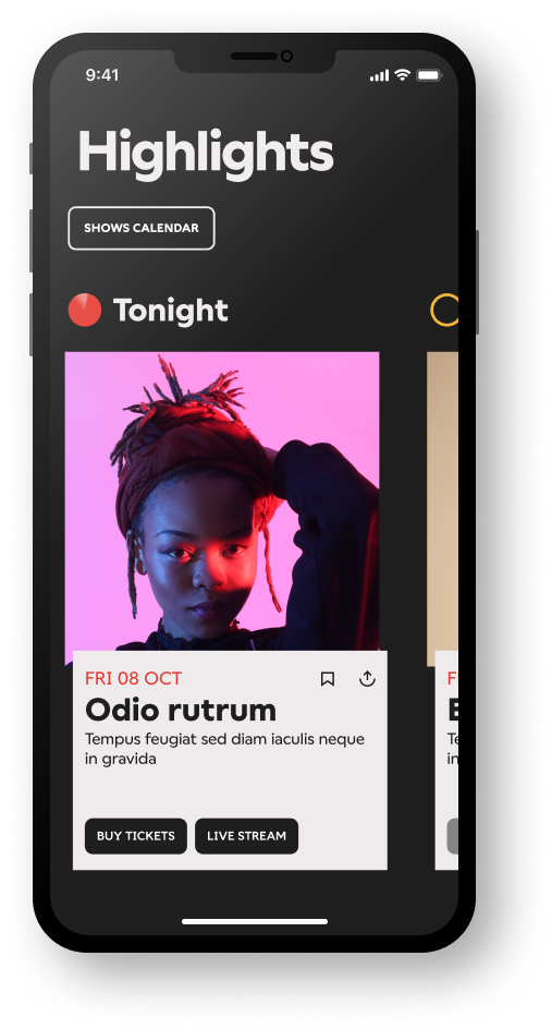
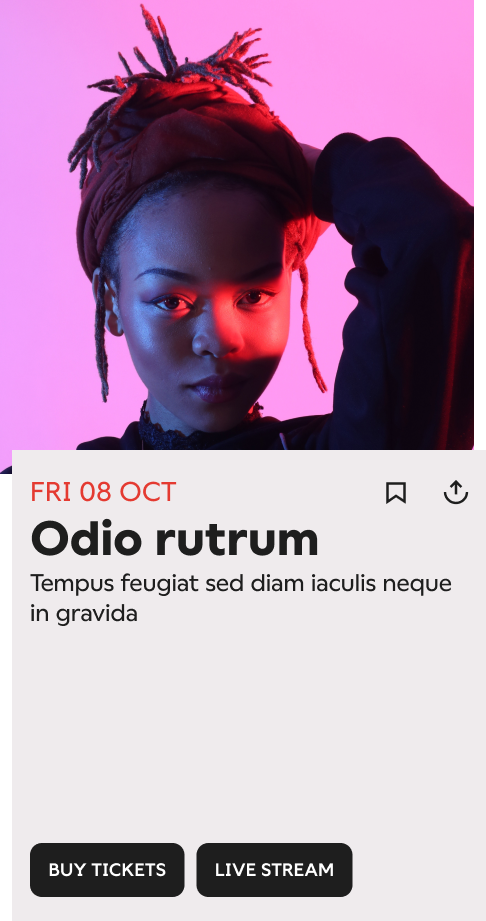
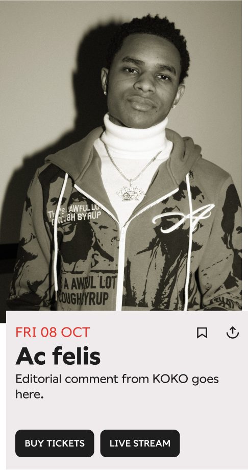
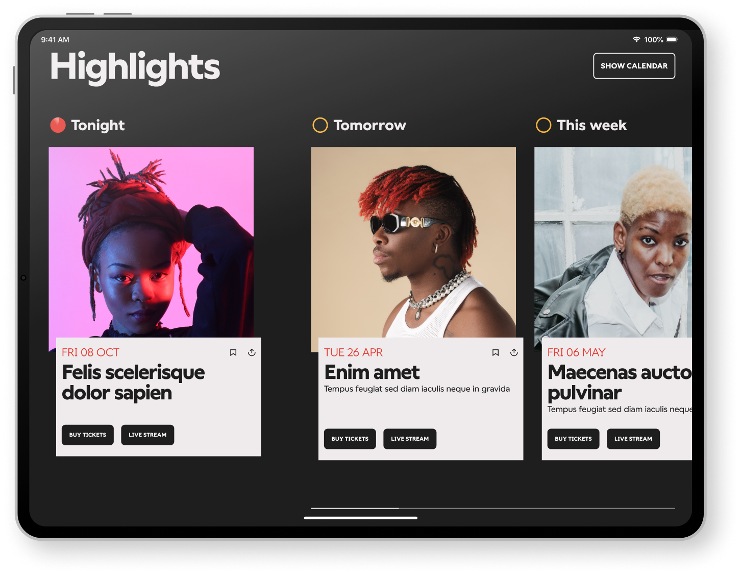
Exploring card information variants.
Using a card based system to promote the individual acts and allow us to re-order / organise under different rules was adopted. In early sketches we explored the optimum card information for the user and what was manageable for the editorial team.
In the end, the final UI adopted a much lighter touch than the early sketches show, the flux in schedules, varying levels of details and scope steered the decision.
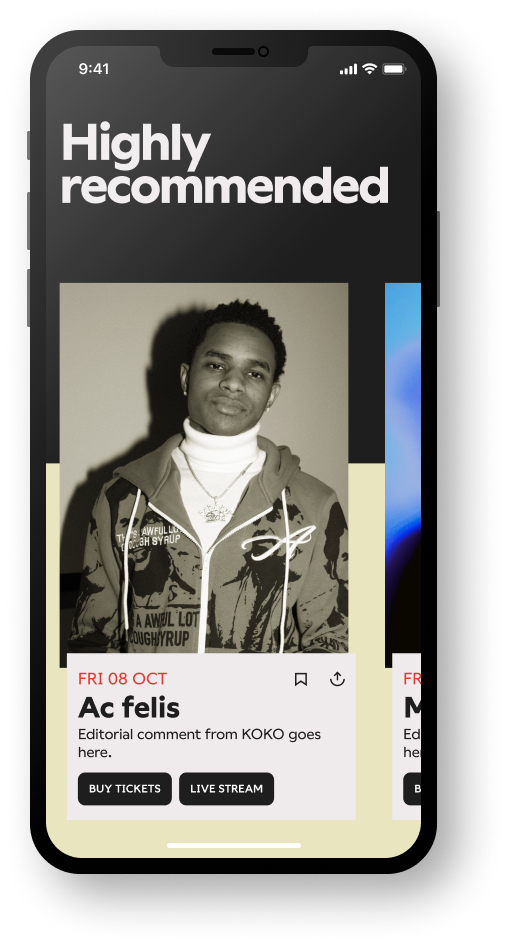
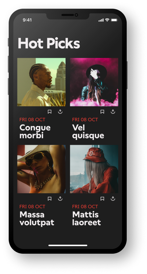
Promotional flex.
Building flexibility in the card layouts through size and content detail allowed the team to produce different promotional content sections from full width/height space to push 'tonights' act - to 'Highly recommended' collections in carousels - to mini cards under a 'Hot Picks' collection.
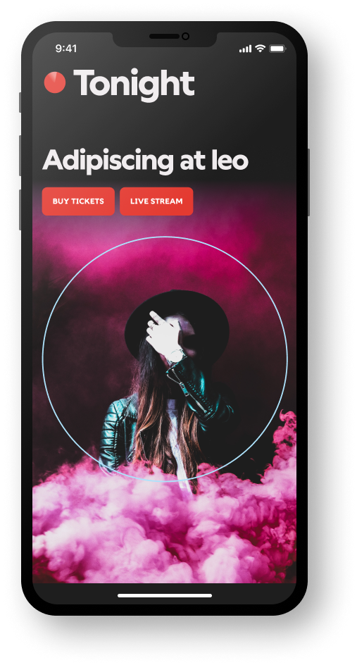
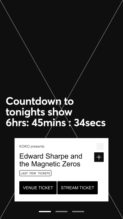
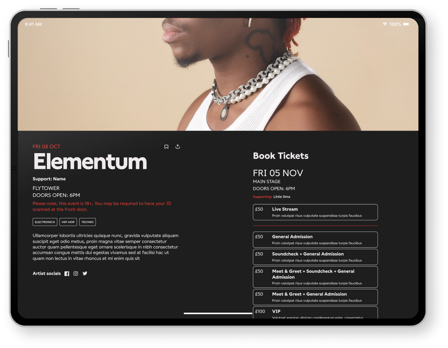
Different states.
We envision different states of key promotion content sections, such as the landing page content header. At different times this could change state, from a resting state, to a split CTA push, a countdown to an upcoming act with ticket purchase, or a Live now state with live streaming options.
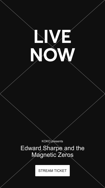
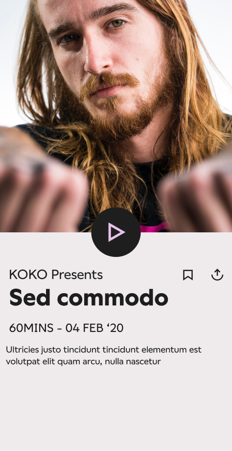
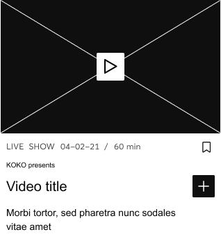
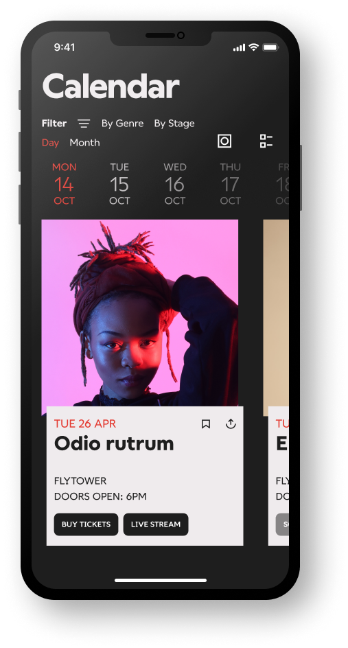
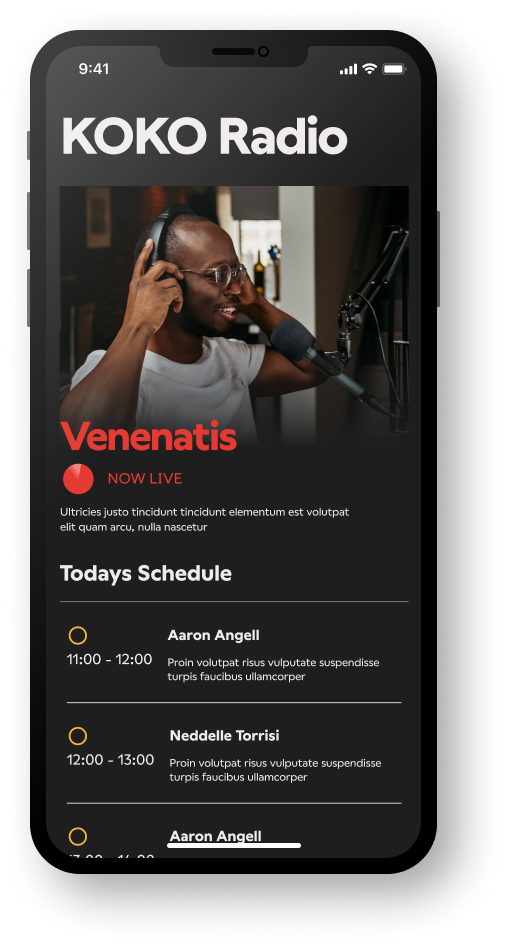
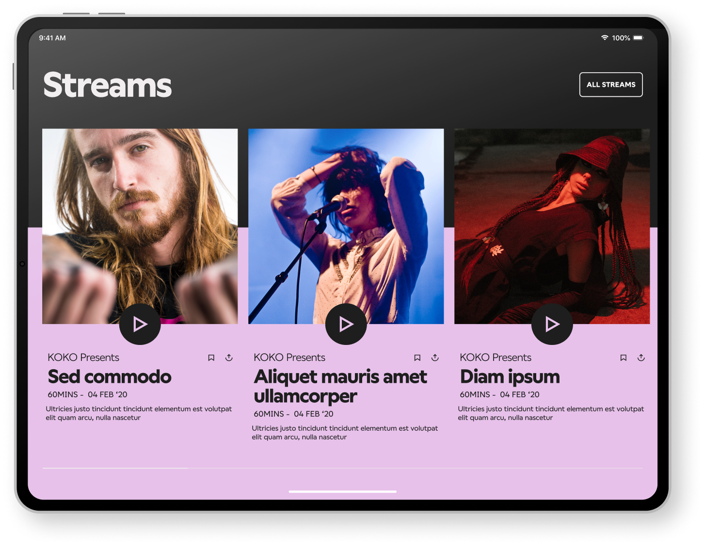
Listen now or watch anywhere.
The vision for the digital experience allowed users to plan visits through a searchable calendar, add future act reminders, and book live streaming tickets to watch later or to listen now with KOKO radio.
Selected Projects


B2B Sports Data Platform - UX /UI DesignProject type


Grosvenor - UX/UI DesignProject type


Duke Of Edinburgh Award - Social CampaignProject type
Property MarketingProject type

KitKat - The Break Emoji Social CampaignProject type

Special Olympics - Encourage Omar CampaignProject type
HiltiProject type
CalpolProject type
Brand Films - Concept / Art DirectionProject type